We print a lot of die cut stickers. Company logos, event giveaways, product labels, laptop stickers for tech teams. The printing part is straightforward. The part that slows things down is almost always the artwork.
Die cut means we cut around your design instead of cutting a square or rectangle. To do that, we need a cut path in your file. Get that right and we print straight away. Get it wrong and we have to come back to you, which costs time.
This is everything you need to know to get it right first time.
The cut path
The cut path is a vector line that tells our cutter where to go. Think of it as drawing around your sticker with a pen and saying "cut here."
In your design software, this needs to be set up as a spot colour called CutContour. One word, capital C at the start and in the middle. This exact name tells our software that line is for cutting, not printing. So the print part goes to the printer and the cut part goes to the cutter.
If you call it something else, or set it as a CMYK colour instead of a spot colour, it prints. You end up with stickers that have a visible coloured line around them. We see this more often than you would think.
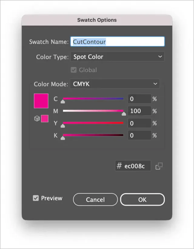
How to set up a cut line in Adobe Illustrator
- Create a new swatch.
- Set the colour type to Spot Color, and name it CutContour.
- Choose CMYK as your Colour Mode.
- Make the colour 100% Magenta (the colour doesn't really matter, but 100M is the standard).
- Apply it as a stroke to your cut path. No fill, just stroke.
- Create a layer called CUT, and put the cut path on that layer so it is easy to find and check.
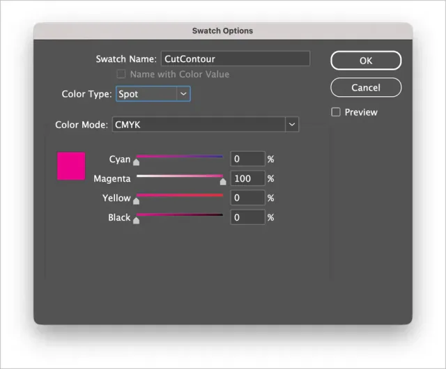
How to set up a cut line in Adobe InDesign
- Create a new swatch and double click on it.
- Name it CutContour.
- Set the colour type to Spot Color.
- Choose CMYK as your Colour Mode.
- Make the colour 100% Magenta (the colour doesn't really matter, but 100M is the standard).
- Apply it as a stroke to your cut path. No fill, just stroke.
- Create a layer called CUT, and put the cut path on that layer so it is easy to find and check.
Keep the shape simple
Our cutter handles smooth curves and rounded corners without any trouble. Circles, ovals, rounded rectangles, simple logo shapes. All fine.
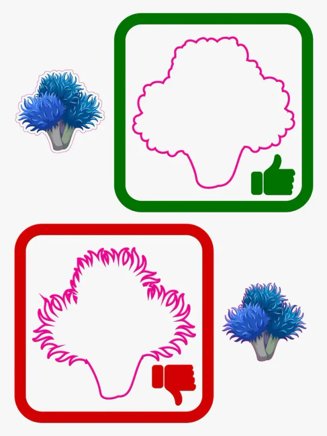
Thin sharp points are where things get tricky. Anything under about 90 degrees can lift or peel over time. The sharper the point, the more likely it is to catch on something and start peeling back. Very thin sections can tear when you try to apply the sticker.
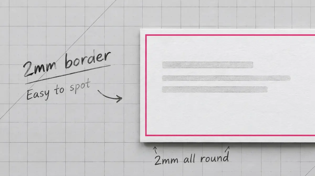
If your logo has sharp points or fine details, we usually suggest offsetting the cut path slightly. Instead of cutting right to the edge of the artwork, we cut a few millimetres out, leaving a small border. That protects the edges, and the sticker lasts longer.
Smooth outlines cut better and faster, and the finished stickers come out cleaner. Too many small anchor points lead to rough edges and cutting problems.
Bleed (when you need it)
If your artwork goes right to the edge of the cut, you need bleed. Bleed is extra artwork that extends past the cut line. It is there to allow for the tiny variations that happen during cutting. Without it, you might get a thin white edge on one side of your sticker.
Add 3mm. Your background colour or image should extend 3mm past where the cut will be.
If your sticker has a white border around the design, you do not need bleed. The border itself gives us tolerance. Same goes for stickers where the design sits in the middle with clear space around it.
Design for tolerances
Cutting is accurate to about 1 to 2mm. That sounds small, but it matters if you have designed something that relies on the cut landing in an exact spot.
A thin border around your design is the classic example. If you have a 1mm border and the cut shifts 1mm to the left, one side has no border and the other side has 2mm. It looks wrong. We even wrote a page about why borders need to be treated with care. Make borders at least 5mm wide and the variation becomes invisible.
Same goes for text. Keep it well inside the cut line. Text running along the edge of a sticker is risky because even a small shift makes it look off.
The mistakes we see most often
- No cut path at all. This is the most common one. We get a logo or design with no indication of where to cut. We cannot guess, so we have to ask.
- Cut path named wrong. CutContour, Die Line, Cutter, Cut-Contour, Cut Contour, cutcontour, Cutline. Only the first one works. The others either print as visible lines or get ignored entirely.
- Cut path set as CMYK instead of spot. Usually happens when someone draws the cut path in magenta or cyan to make it visible while working. If it is not converted to a spot colour before export, it prints.
- Cut path has a fill. The cut path should be stroke only. If it has a fill, strange things can happen.
- JPG or PNG file. We cannot extract a cut path from a flat image. We need vector artwork, or at least a PDF where the layers are preserved. If all you have is a JPG, we can trace it and create the cut path for you. That adds time and may cost extra.
What to send us
A PDF with the layers preserved is best. Native Illustrator files work too. EPS is fine as long as the spot colours come through.
If your artwork includes photos or images, make sure they are at least 300dpi at the size they will print. Lower resolution looks pixelated. Set everything up in CMYK. RGB files get converted and colours can shift slightly.
Quick checklist
Before you send the file:
- Cut path on its own layer
- Cut path is a spot colour named CutContour
- Cut path is stroke only, no fill
- Smooth shapes, no sharp points
- 3mm bleed if artwork goes to the edge
- Text and important bits well inside the cut
- PDF, AI, or EPS format
- 300dpi images, CMYK colour
Not sure about something?
Send us what you have. We check every file before printing and will let you know if anything needs attention. If you are not confident setting up the cut path yourself, we can do it for you. Just mention it when you order, or email hello@wedoprinting.ie.